Monday, 20 September 2010

I love Snes


I don't know what made me think of the classic Super Nintendo maybe it is the new advert celebrating their 25th Anniversary ?

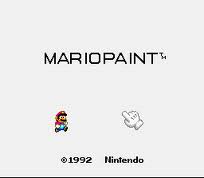
Anywho I just thought I should reminisce about the good old days, and the fact it wasn't as traumatic as the video games of the present. You could use Mario Paint and basically draw with your snes but not as well as with actual paper. Or you could make sweet Music with the compose game, using: dogs, love hearts, mushrooms, houses and Mario heads to compile a indescribable 2 minute sound that resembles a song.
These games don’t sound that interesting to you probably but I loved them! They didn’t make you cry and you always win, I can’t handle high stress. I panic even when I’m watching someone else play. Games like Tomb Raider are not for the faint hearted; I’m even apprehensive when the butler is following you around her house. Anyway go watch the advert it made me recall some right good times, back in the day when I used to carry a plastic turtle around and wear snowsuits.

Monday, 13 September 2010

To the Queen


Lover of everything quintessentially British I bought a gorgeous cushion recently with a brilliant pattern on it and I thought it would look wonderful as a illustration - so here it is, well I edited a tiny bit.

Sunday, 12 September 2010

Pac man re-invented

watch on Youtube >>> Pac Man


Trawling through the world wide web today and I stumbled across this little gem on 'BuzzFeed':


"111 human pixels play a stop-motion game of auditorium Pac-Man over the course of 4 hours as part of the GAME OVER Project from the French-Swiss artist Guillaume Reymond. In France, Pac-Man says “glouglou glouglou” instead of “waka waka”."


Genius and has a great great attention span! 4hours!


Hello Sailor!

New Illustration of mine, bit 'o' Nautical Niceness 

Thursday, 26 August 2010

Coca Cola

Filling my time doing illustrations, this is a development of a Coca Cola poster.


Tuesday, 24 August 2010

Illustration play


This is a illustration I have made recently, to just warm myself up again, this is a timeline of how i designed it. Angry Old Owl Lady.

Morgan Spice Website


This month from 2nd August through to the 22nd Morgan Spiced Rum brought out their very first advertising campaign on the TV.

It was designed and made by Grey London, who has also created wonderful adverts such as the Boss Orange ad with Sienna Miller and Country Life Butter.

The ad was called the ‘Modern Adventure’ and features a group of men undertaking a succession of eccentric adventures on their way to their local bar, it is to encourage people to take risks and adventures in the everyday.

At the of the ad it promotes their new can of Rum and cola that you can get a free sample of if you enter their website. And I love a freebie so I had a peek and I love their website, it is what you would expect from Morgan Spice it is dark but inviting and has a quirkiness to it, it has some great flash design and is very very entertaining, telling you interesting ‘ice breakers’ for meeting new people. ‘Golden attire’ :what to wear on your adventures. And the best of all, you can type your postcode in and it will find all your local bars and pubs.

I love Morgan Spiced Rum and I always have, maybe I’m a bit biased but I don’t think so. Have a look yourself…. As Tony the Tiger would say “Its greeeaaattt”

www.morgansspiced.co.uk

http://www.grey.co.uk/

Saturday, 14 August 2010

Animals

This is the first installment of my animal design project, I thought of this a few weeks ago, to make me brush up on my drawing skills, so I think I will make it into a extensive project. I will be exploring illustration and patterns to create maybe a sequence or wallpaper pattern design. So here is my first go at an animal. This is the quintessentially British Bulldog.

Sunday, 25 July 2010

sexy colours


mmmm people say green and pink dont go..... Your wrong. Look at my gorgeous clas ohlson cup and straw mmmmmmm

Thursday, 8 July 2010

Unis over & Mother design london

So uni is finished, 3years has flown by and I have received 2:1 which I am pretty damn pleased about!

So now what to do what to do……

Well Job hunting is a big point and keep myself inspired and maybe do some personal projects to keep me sane.


But another is to keep on finding interesting, funny and brilliant design. This week I’m just going to go through past adverts I love, that may not even be that designerly but just great!

 This week I have just discovered Mother design agency. I have seen some of their work in the past but looking on their website I just cant believe how much they have done and that I know or recognise all of their advertisements.

Talk to Frank - Pablo

^ view advert here

For starters mother has created Pablo the Dog for the Call Frank drug adverts. Which I think is just genius and is positively hilarious. Mother London created Pablo the drug mule to deliver a range of messages uncovering the truth and revealing the darker side of cocaine. Whether it’s a pair of disagreeable nostrils, an out-of-control human heart, or a customs official’s rubber glove, no-one is safe from Pablo on his quest to find out more about cocaine and to arm young people with facts while he’s at it.

Oasis for people who don’t like water! Rubberduckzilla.

^ view advert here

The story was told across several media; from the augmented reality experience at Rubberduckzilla.com, through to the manga-style comic of his back-story distributed with Zoo magazine. The campaign has generated an overwhelming response, contributing to Oasis’ impressive growth while the rest of the category shrank. You can play the online game here; http://www.rubberduckzilla.com

Coca Cola - Yeah Yeah Yeah La La La

^ view advert here

Developed at Christmas to connect coke to summer, Mother London created ‘Yeah Yeah Yeah La La La’ to encapsulate the hazy, laid-back feeling of the summer months with Coca-Cola. Brought to life in an original composition by Calvin Harris, illustrations by Ronald Kurniawan and a TVC directed by Dougal Wilson.

This advert is so different to the coca cola brand and that’s why it works so well. And how cute are the gismo look-a-like creatures! La la la

Pot Noodle the musical

^ view advert here

After several years of trying to simultaneously please both a youth audience and their mums, Mother London decided it was time to give the brand back to its consumers. Taking inspiration from YouTube pastiches, Steve and Digger were created; a pair of wannabe musicians and avid fans of Pot Noodle.

This campaign wowed the British audience and made everyone sing along to cheesy and mocking lyrics.

Pimms The call

^ view advert here

Created by Mother introducing the Pimm’s 8, a gang of eight different characters that represent all the ingredients needed for “the perfect Pimm’s serve” has proved a winner with the public.

 ‘The Call Up’ was aimed to retain “the brand's unique sense of humour and the juxtaposition of its perceived posh credentials.”

The anthem the Pimm's 8 rally to is the ‘New Avenger's theme music aiming to bring about “a sense of energy, fun and anticipation of the fun filled summer event ahead.”

Once in tight formation they storm a local BBQ releasing ‘Pimm’s O’Clock’ on the unsuspecting party.

I personally love Mint man, flying down and shrugging off his hand gliding suit… hes a bit mint.


Tuesday, 22 June 2010

Degree show June 18th - June 24th


It was D&AD's third year degree show this week and it is showcasing everyone in our years work, it was a wonderful success and the opening night was amazing. all the work looks very professional and fantastic. I may be biased because Im in it but I think this years work is sensational and the publication and advertising has worked brilliantly. The photographs of us all in knitted beards brings comedy to the show. above is the work that i have presented and my sorted guide book is on show in the book room also.

visit our website at:
http://www.design-and.com

DNA


24th & 25th June 2010!!! DNA EXHIBITION AT THE TRIANGLE come down to see.


About::::

Universities from across the North have teamed up with the region’s design and communications agencies to form the first annual DNA (Designers Northern Alliance) event, taking place in Manchester this June.

The event is being organised by a number of contributors from the University of Salford, University of Chester, Manchester Metropolitan University, UCLAN, Liverpool John Moores University & North Wales, along with a substantial number of agencies from across the region. It will be taking place at The Triangle (the old Corn Exchange) on the 24th and 25th June.

The idea behind the event is to showcase the newly graduated creative talent from the region’s universities. The event has been designed to bring together representatives from the industry and academia to develop links into work and to share best practice – whilst highlighting the work carried out in the advertising, animation, illustration and digital media and graphic design courses from the universities.

Jo Greenhalgh, communication pathway leader in graphic design at the University of Salford, explains:
“Over the two days, the event will include an exhibition of the best of the graduate talent from universities in the North of England; we will be hosting a series of keynote lectures from industry and academia, a roundtable discussion, a question and answer forum and portfolio surgeries for students.

“We have been really heartened by the levels of interest in the event, and feel it will be a really worthwhile event that will be mutually beneficial for both the students who attend and the agencies who will be the first to meet the best graduates from our region’s institutions.”

The two day event will have a series of talks and portfolio surgeries with over 30 professionals from 15 agencies (to date), giving advice and feedback to students on their work. There will be a round table discussion and a question and answer forum with industry experts as well as a space for selected students to offer a private view of the best work to the industry.

Speeches will be given by high profile members of the North’s design and communications industry including Warren Drumm of GyroHSR, Chris Arnold of Creative Orchestra and Si Scott, the prolific graphic designer.

Support for the event has been impressive, with confirmed input coming from The Drum, Tayburn, Hyper Island, LOVE Creative, Vivid, Raw, Severe, KMP, Cheetham Bell JWT, Uniform, GyroHSR, Code Computer Love, Elmwood and Kernal.

Tuesday, 1 June 2010

Sorted - guide to manchester


This was my most enjoyed project, out of the whole year.

It was a self-written one and I think I have produced a great outcome. It was a long project but I think my finished product is better than I even expected. It is a 50-page guide to Manchester, aimed at 18-30 year olds.  Informing about the typical and not so typical Manchester. It is to compete with the current tourist guides and I think it is more personal and inviting than any of them. It is colourful and experimental with design, it is to entice the viewer as well as teach them. As well as the guide I have put together promotional products also: I have created 6 postcards, 4 posters, 4 badges and numerous designs for I-phone applications.

Tuesday, 25 May 2010

french stitching my guide book


24th May 2010


Today I learned to French stitch!

So I am in the final leg of finishing my guide book! Thank god, and after a lot of deliberation I decided that French stitching it would be the way to go as it will look very professional and like a proper magazine.

I had to figure out how to layout out the pages to make it open up like a perfect bound and then I chose my stock and double sided printed on the A4 colour printing in the mac suite, I had a bit of drama with printing but after two hours it was ok.

Then I went to the book binding workshop room to speak to Hilary about how to do it and she set me off on the ins and outs. I was a bit overwhelmed at first but once you get started its fine. After I had stitched it, I pressed it and glued over the spine so it stays strong and doesn’t wobble about.

All I need to do now is put the cover on and guillotine it, but I am not inducted on the scary machine so I have to wait till Friday when Hilary is in and then glue my cover on.

The cover is double sided printing on to Cartridge paper 200gm, so it is thicker than the pages but still has a nice textured feel.

So when I have done all that I will take photographs of it in real life situations and with a plain background. And make it presentable for my portfolio and degreeshow  

Thursday, 20 May 2010

My work is now on Rainy City Stories website


Remember my project for March/April.  It was a self-written project to produce five designs for five stories on the website Rainy City Stories. I used collage, photography, mapping and information graphics.

The aim of the brief was to show the designs with the stories. Well I have finally emailed Rainy city Stories and they have put my designs with the stories, which is bloody fantastic! I am so pleased and it has happened so fast. They look great and my website url is with them so its promoting me.

http://www.rainycitystories.com/2009/05/26/the-busiest-bus-route-in-europe

http://www.rainycitystories.com/2009/08/13/not-yet

http://www.rainycitystories.com/2009/02/23/the-victoria-baths

http://www.rainycitystories.com/2008/10/20/rusholme-ruffians

http://www.rainycitystories.com/2008/11/03/narcissus-the-double-daffodil